NGO Redesign Sprint
The Lower Mainland Christmas Bureau
Overview
Our team was tasked with identifying a community organization that could benefit from our Product Design skills. After careful consideration, we selected the Lower Mainland Christmas Bureau, an organization dedicated to collecting and distributing toys to families in need during the holiday season.
Our goal was to enhance the Bureau's digital platforms to improve efficiency, increase community participation, and ultimately bring joy to more families during the holiday season.
Roles and Duration
Product Designer
UX: User Interviews, Competitive Analysis, Persona Mapping, Storyboarding, Affinity Mapping
UI: Sketching, Wireframing, Usability testing
November
2024 - 5 days
Tools Used
Figma, Figjam, Quicktime, Canva
The Problem
A strong online presence is crucial for non-profits to effectively engage with potential donors and volunteers. In today's digital age, a well-balanced online identity is essential for reaching a wider audience and building a strong community.
This online presence serves as a vital platform for NGOs to communicate their mission statement, spread awareness about their work, and demonstrate impact on the community. This can be achieved at a relatively low cost compared to traditional outreach methods.
However, when an organization's online presence fails to communicate its past achievements, current initiatives, and future goals with clear evidence and compelling storytelling, it can negatively impact how potential stakeholders perceive it’s credibility. This can ultimately hinder fundraising efforts and discourage community engagement.
The Solution
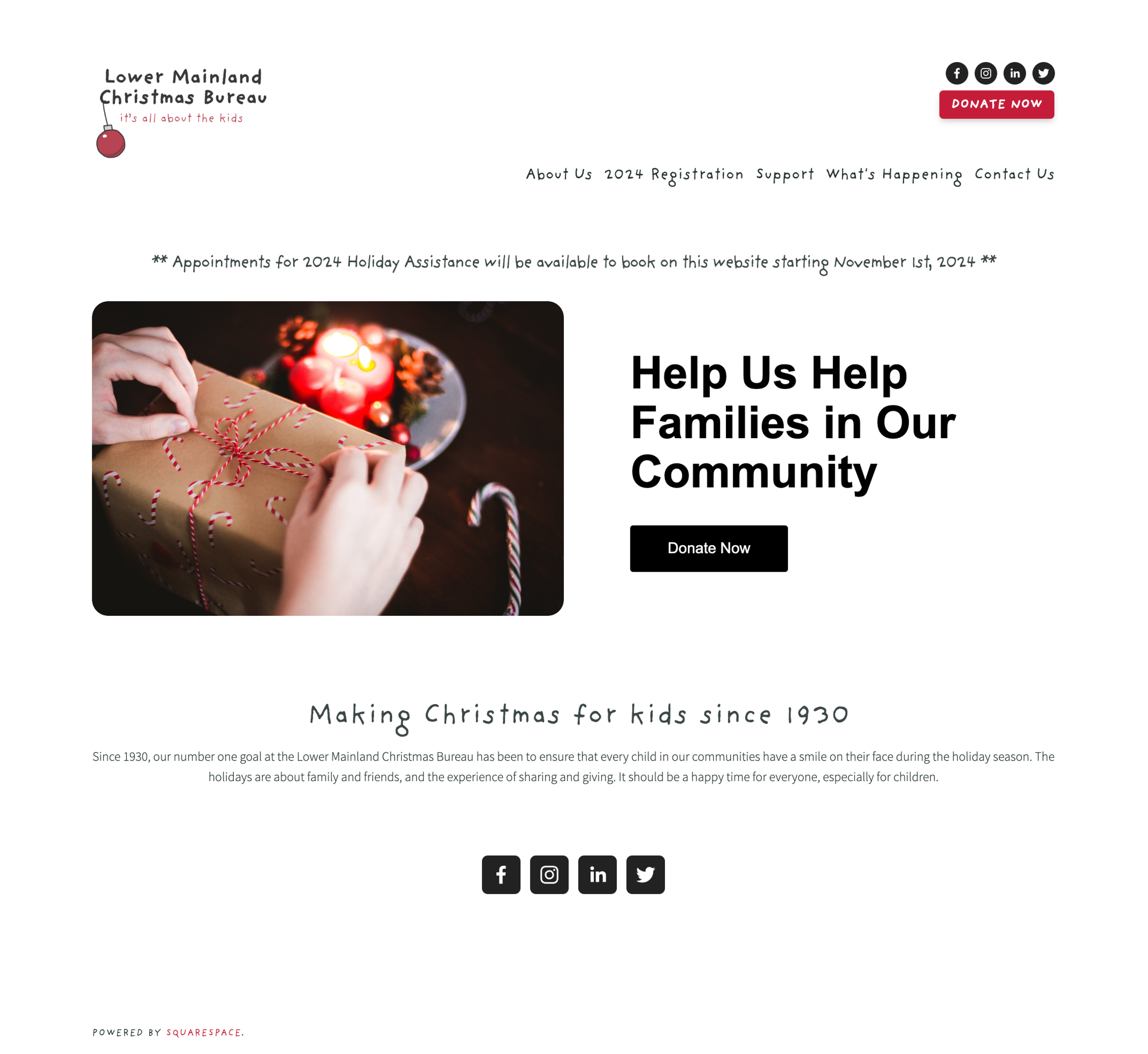
The redesign of the Lower Mainland Christmas Bureau provides an engaging NGO online identity with clear messaging and imagery to promote participation from it’s community.
This solution aims to increase the rate of volunteer inquiries and serve as a strong marketing opportunity.
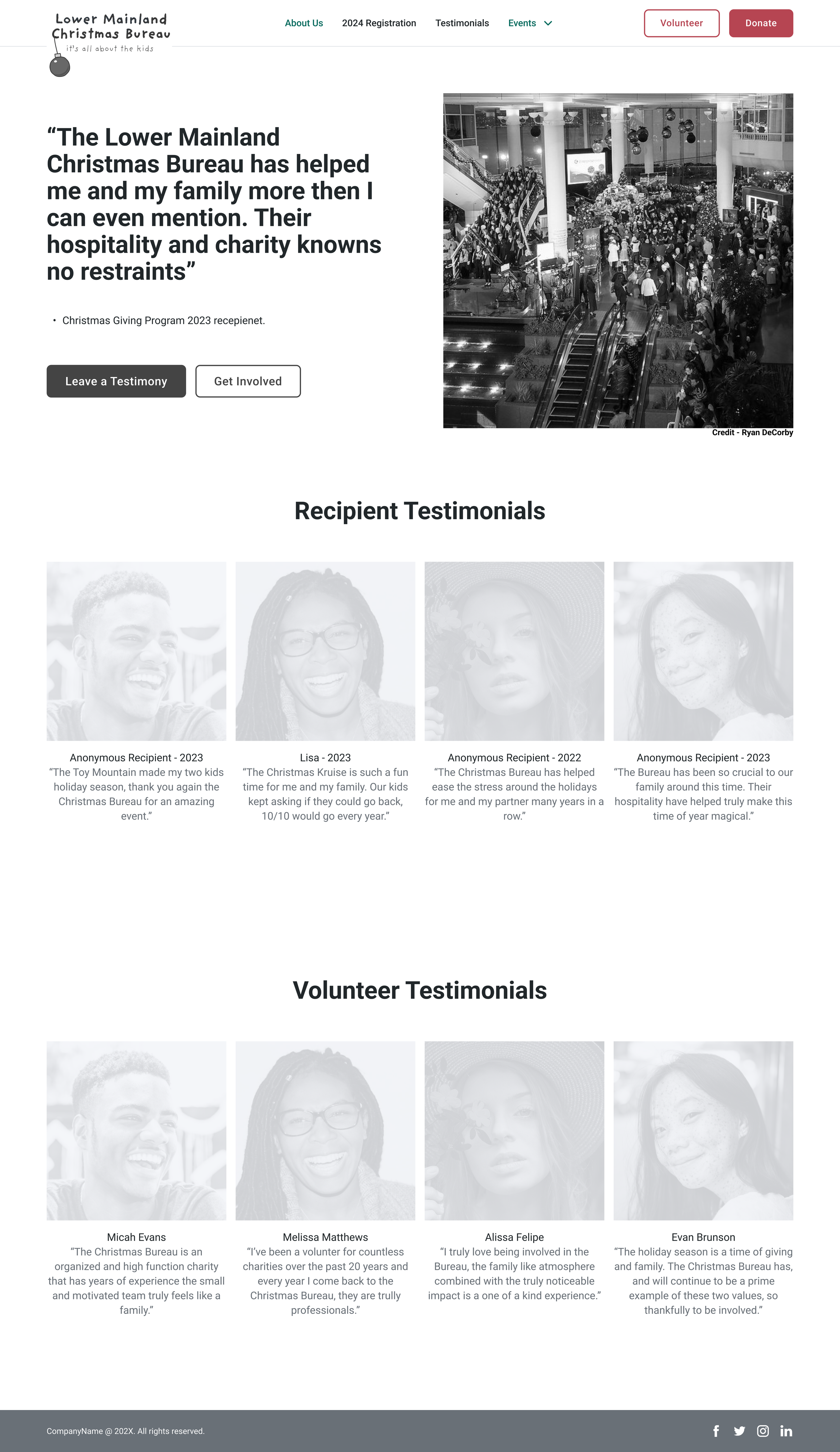
Testimonials
To make the organization more credible to online users, we created testimonial pages which would include images and quotes from past volunteers and recipients.
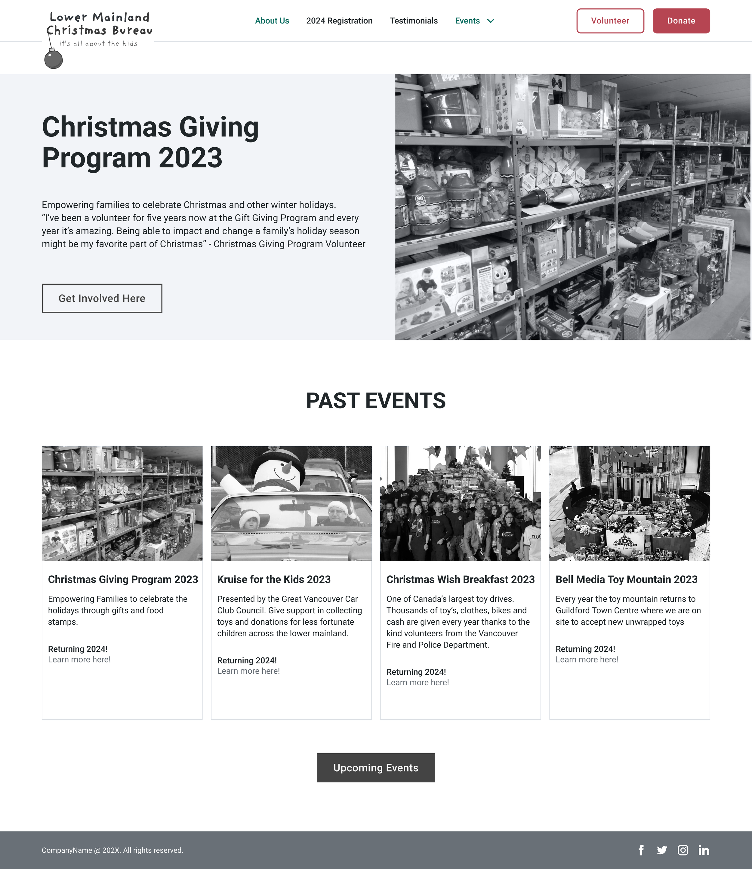
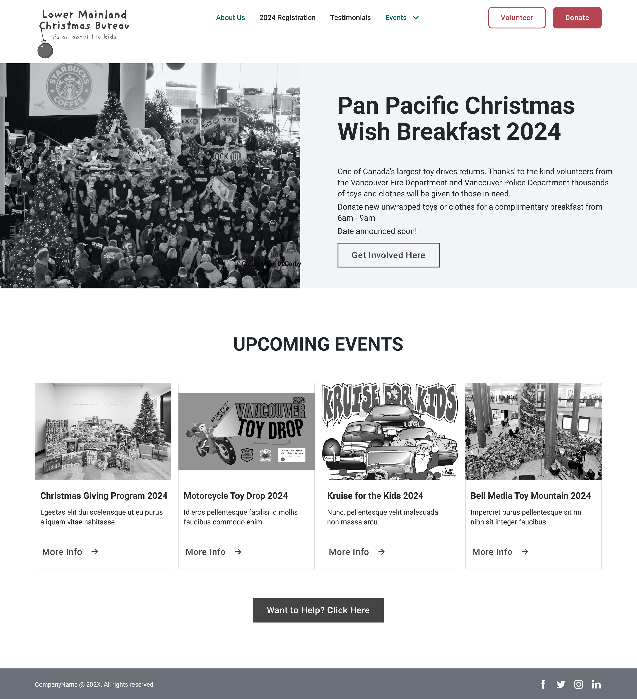
Past and Future Events
To build trust and encourage support, we enhanced our past and future event webpages with photos and more informative text. We believed this will give prospective volunteers and donors greater confidence in the NGO's work and impact, inspiring them to invest their time and resources.
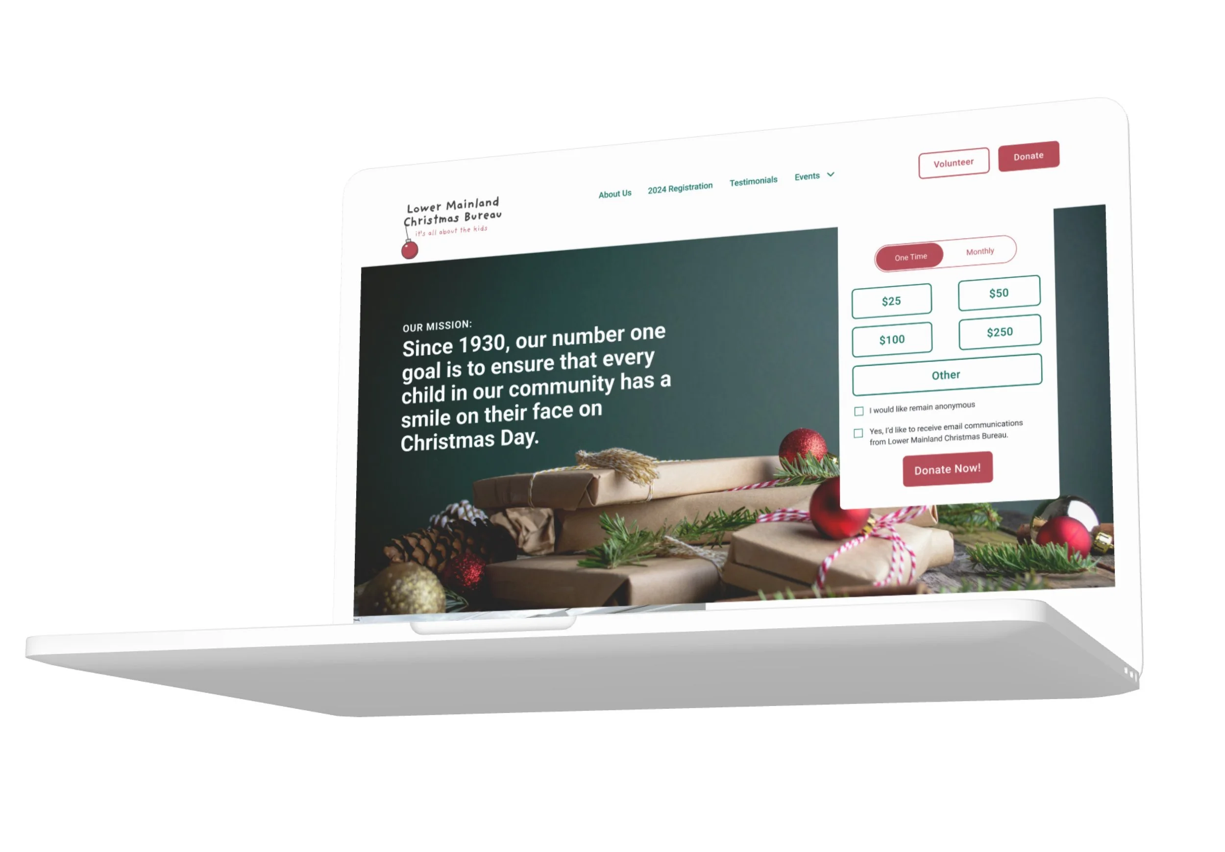
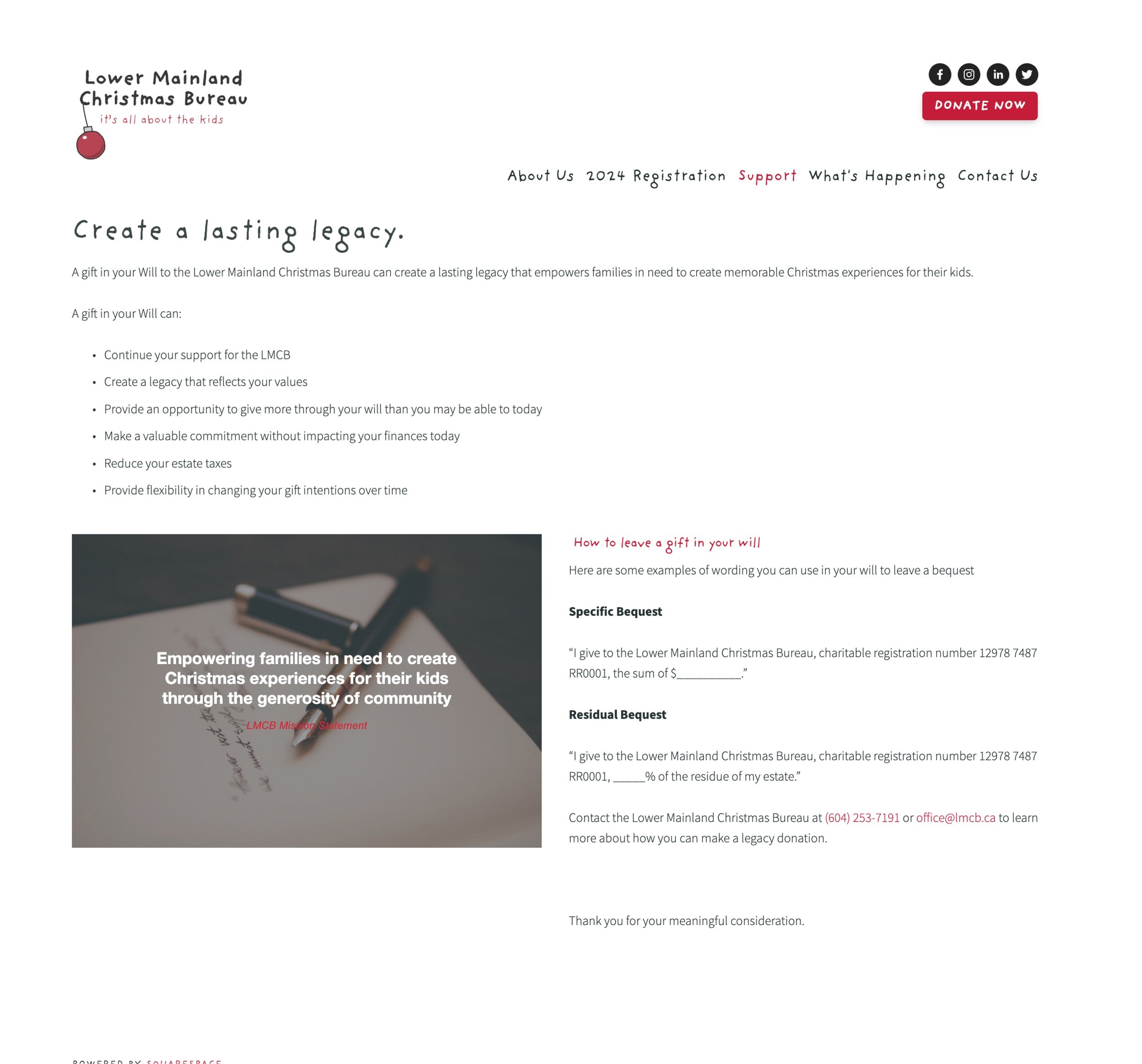
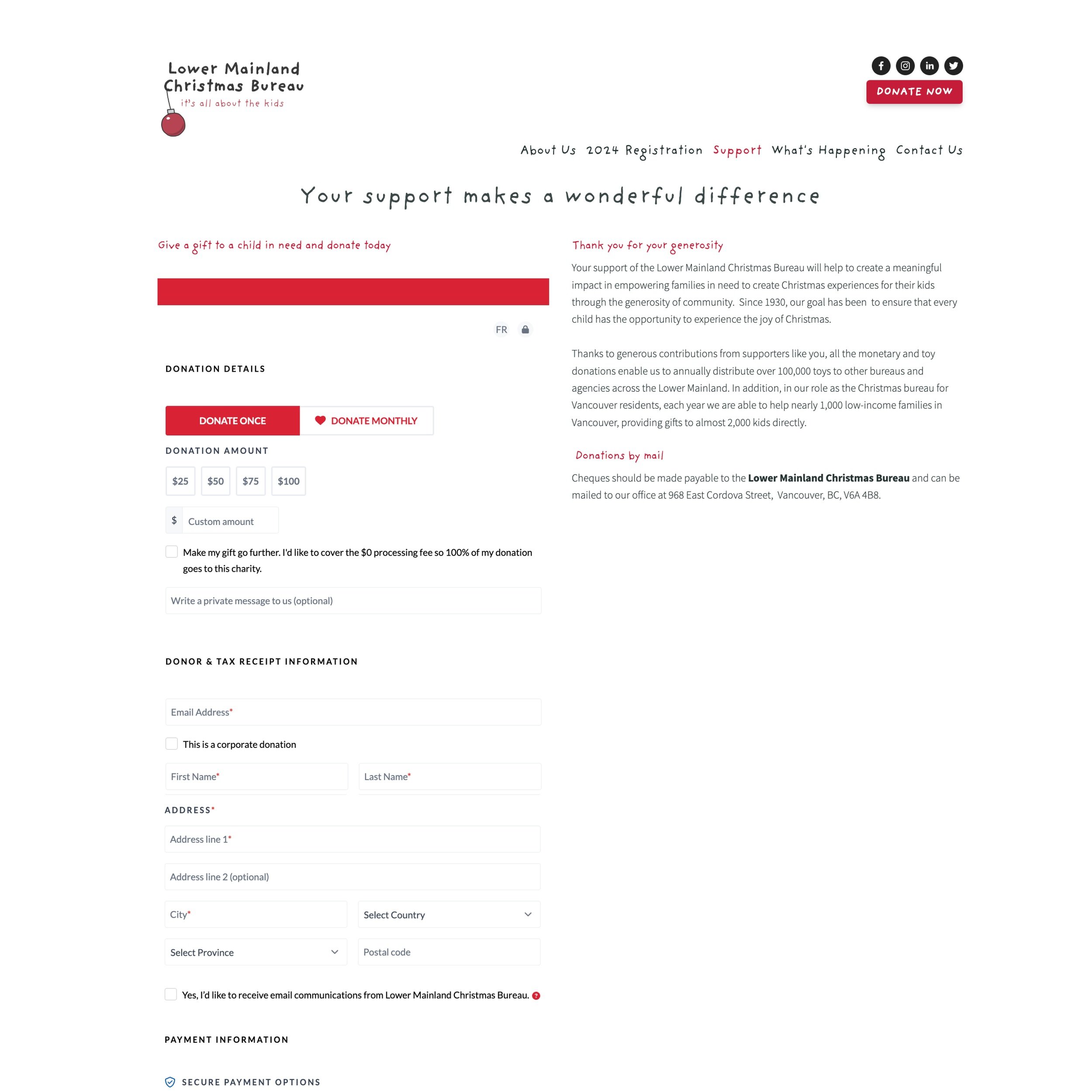
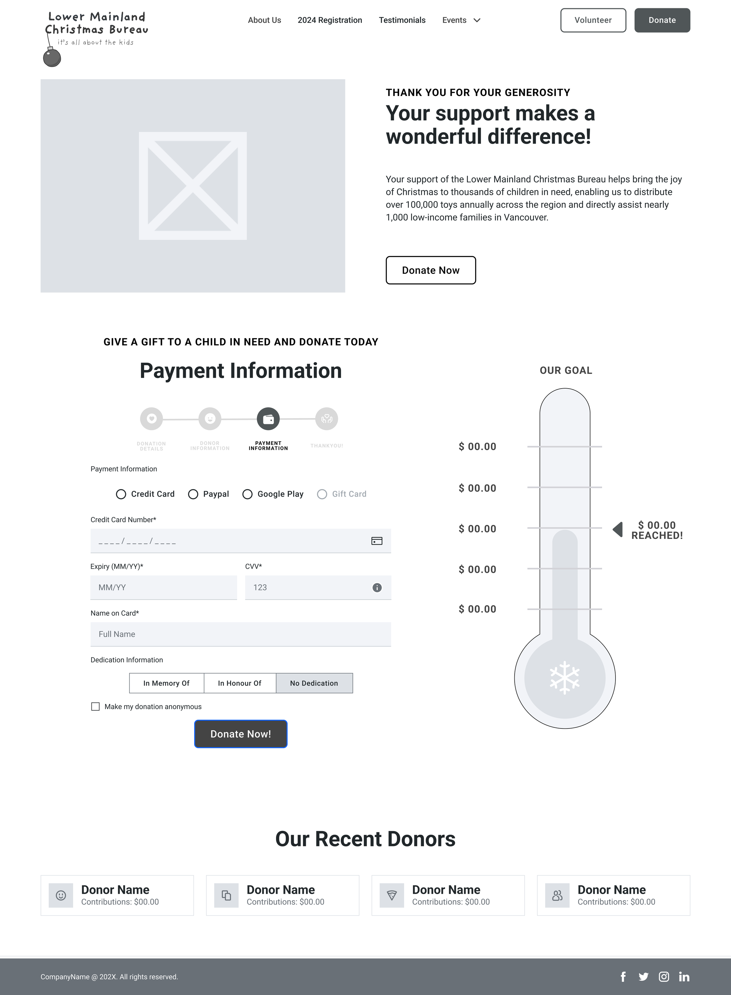
Donation Process
We designed a simple yet impactful donation pathway to encourage both financial contributions and volunteer engagement, culminating in an invitation to donate time using breadcrumbs.
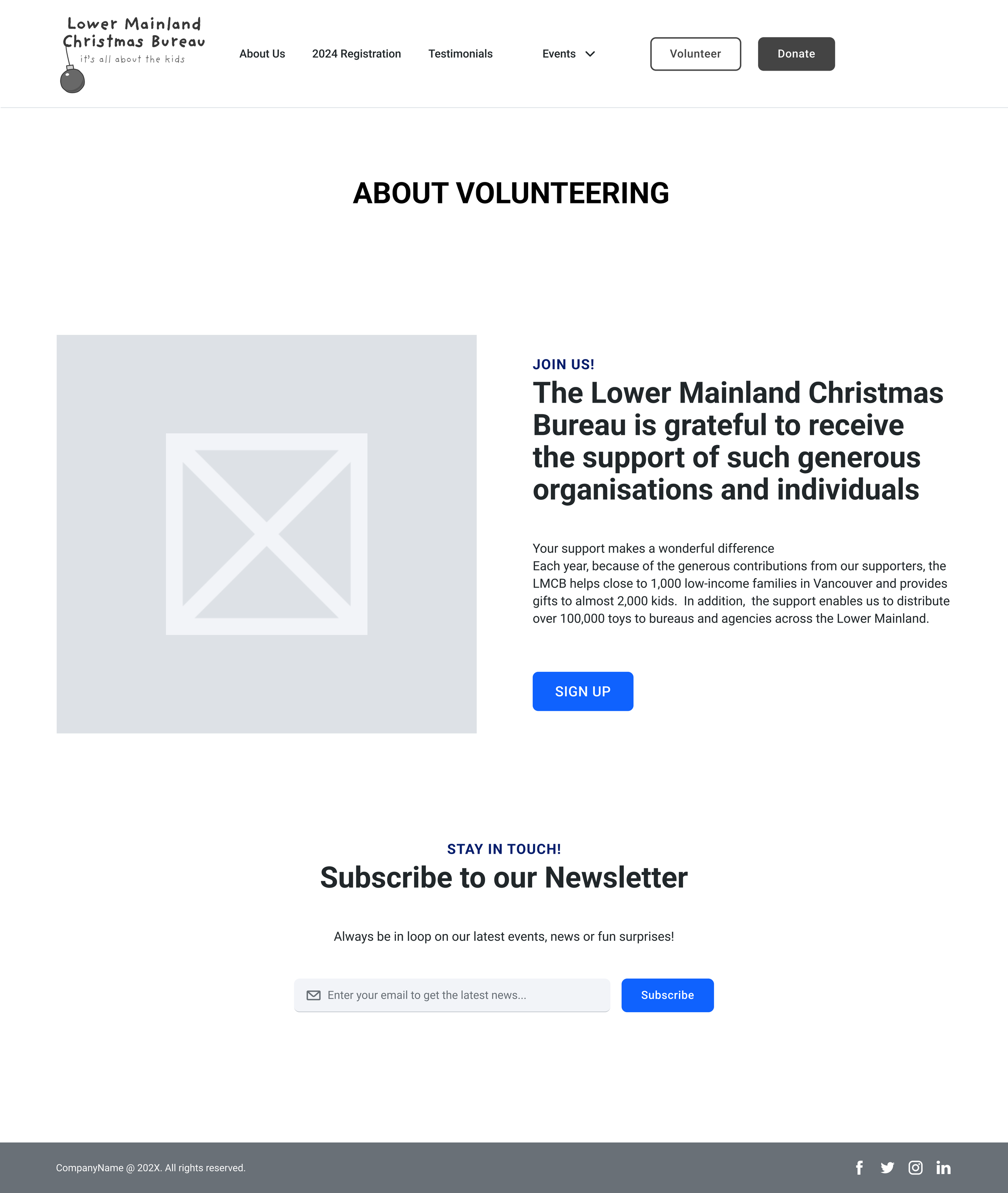
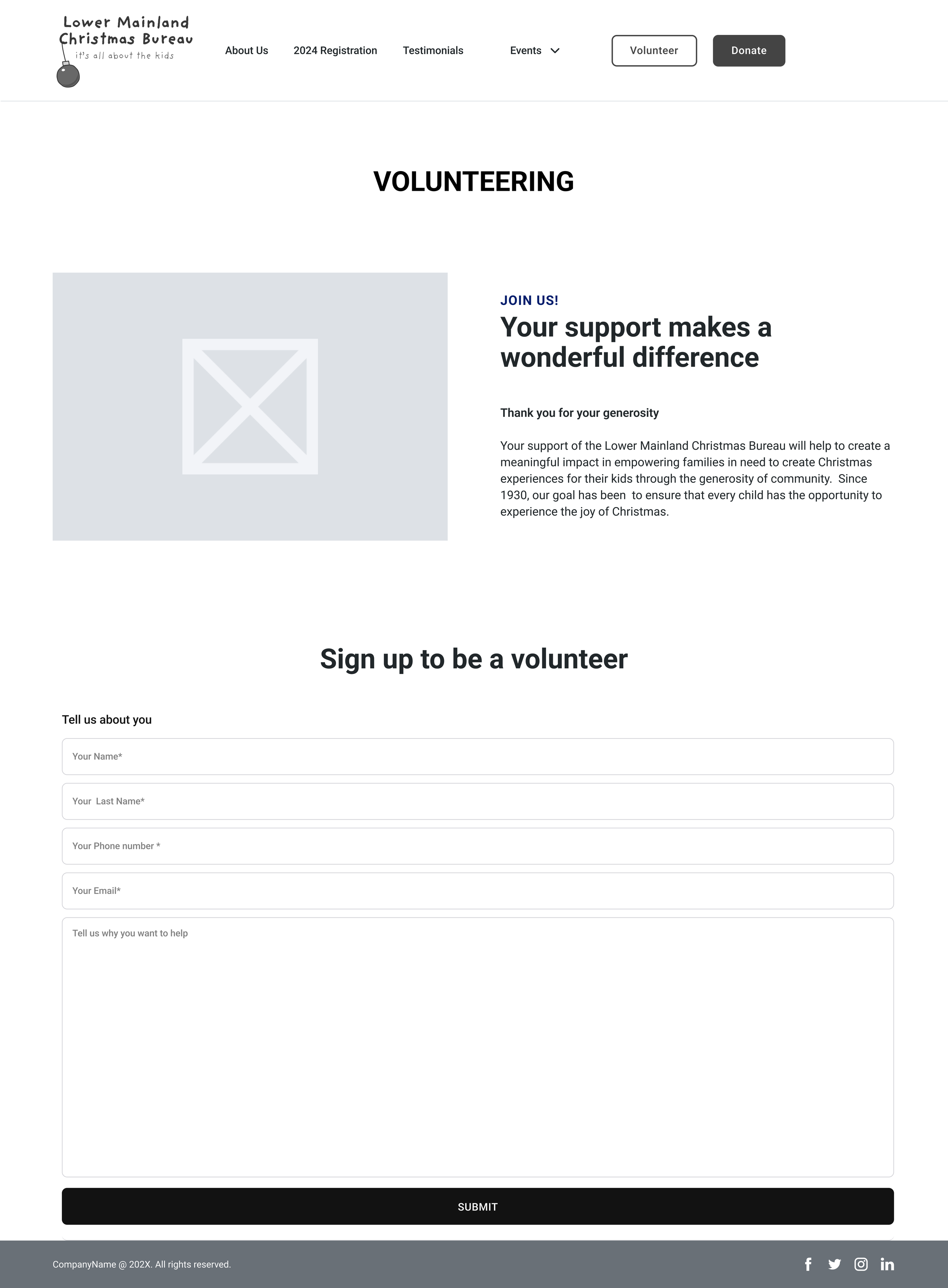
Volunteer Registration
To make the organization more credible to online users, we created testimonial pages which would include images and quotes from past volunteers and recipients.
Research
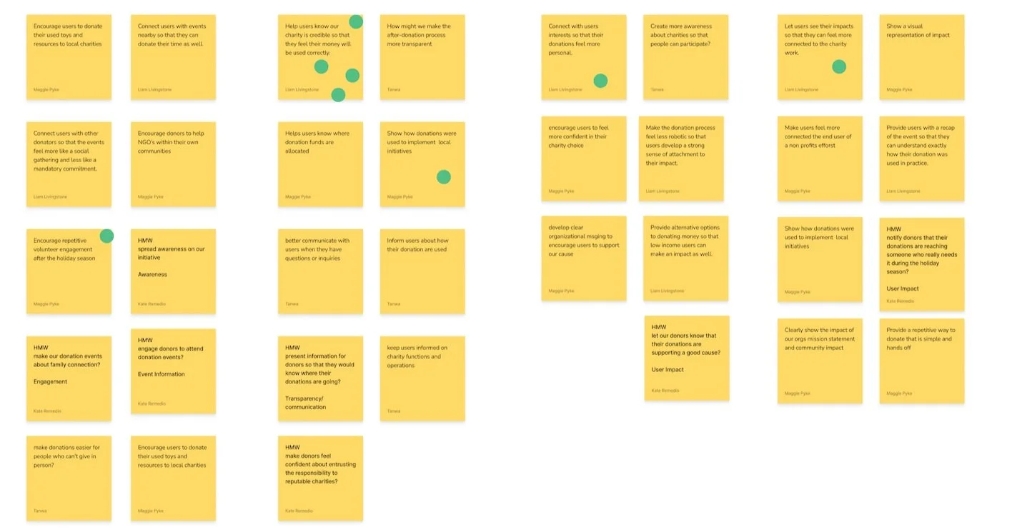
Our initial phase focused on understanding the broader context. We conducted secondary research on the non-profit sector, analyzed the competitive landscape, and interviewed key stakeholders to gain insights into the current landscape and identify potential opportunities.
Next, we identified our target users. Recognizing the crucial role of volunteers, we focused our efforts on enhancing their experience. To achieve this, we conducted interviews with five participants who represented our target user group. Utilizing open-ended questions, we encouraged creative responses and gained valuable insights into their motivations, pain points, and behaviours related to the donation and volunteer process over the holiday season.
Insights
Credibility & Transparency
Help users know our charity is credible by providing ample evidence of successful past initiatives
Keep users informed on charity functions and operations for transparency
Provide a strong online identity that encourages engagement from volunteers and donors
Motivations
Wants to give back to his community
Wants to see their direct and actionable impacts.
Wants to connect/seek social connections
Seeks learning opportunities for personal growth
Painpoints
Struggles to find credible charities that he can donate his
time to around the holidays.
Finds most charities don't showcase impact and wants to
know what he is signing up for.
Following secondary research and interviews, affinity mapping highlighted a key theme to donor and volunteer engagement: a perceived lack of organizational credibility and transparency arising from inadequate visual evidence of previous successful events and their beneficial impact on the community.
How might we help adults feel confident in the credibility of our organization so that they feel assured their involvement will make a positive community impact?
Design Process
Persona : The Community Leader
To inform our UI decisions, we conducted a Usability Heuristic Evaluation of the existing website. Our analysis highlighted three key usability issues. Among these, the violation of the 'aesthetic and minimalist design' heuristic was most prominent. This became our primary area of improvement, as we believe a cleaner design will significantly enhance the user experience.
Aesthetic and Minimalist Design
The website required a clearer pathway of information hierarchy to improve readability for users. In addition, we discovered that CTA’s were inconsistent in format, leading to potential confusion in a user’s journey.
Encourage Engagement
Encourage users to donate online when they aren’t able to attend events in person
Provide a fast and easy way to access key organization information
Provide visual evidence of organizational events and easy-to-understand donation options and or volunteer needs
Donation Process
Clear organizational messaging to encourage users to support our cause
Connect with users interests so that their donations feel more personal
Donation process should be more engaging with potential visual markers of success and impact
Convenience
Encourage users to donate online when they aren’t able to attend events in person
Provide a fast and easy way to access key organization information
Provide visual evidence of organizational events and easy-to-understand donation options and or volunteer needs
Flexibility and Efficiency of Use
The current website's poor internal navigation forces users back to the homepage. To improve this, we enhanced navigation and used visual storytelling to showcase past initiatives and increase user understanding of the non-profit.
Consistency and Standards
Beyond flexibility issues, we found inconsistent design elements, like CTA buttons with varying colors and sizes, which increased user cognitive load. To improve this, we'll standardize website features to meet user expectations
Landing Page

About Us Page
Donor Information Page
Donation Page

Upcoming Events Page

Past Events Page
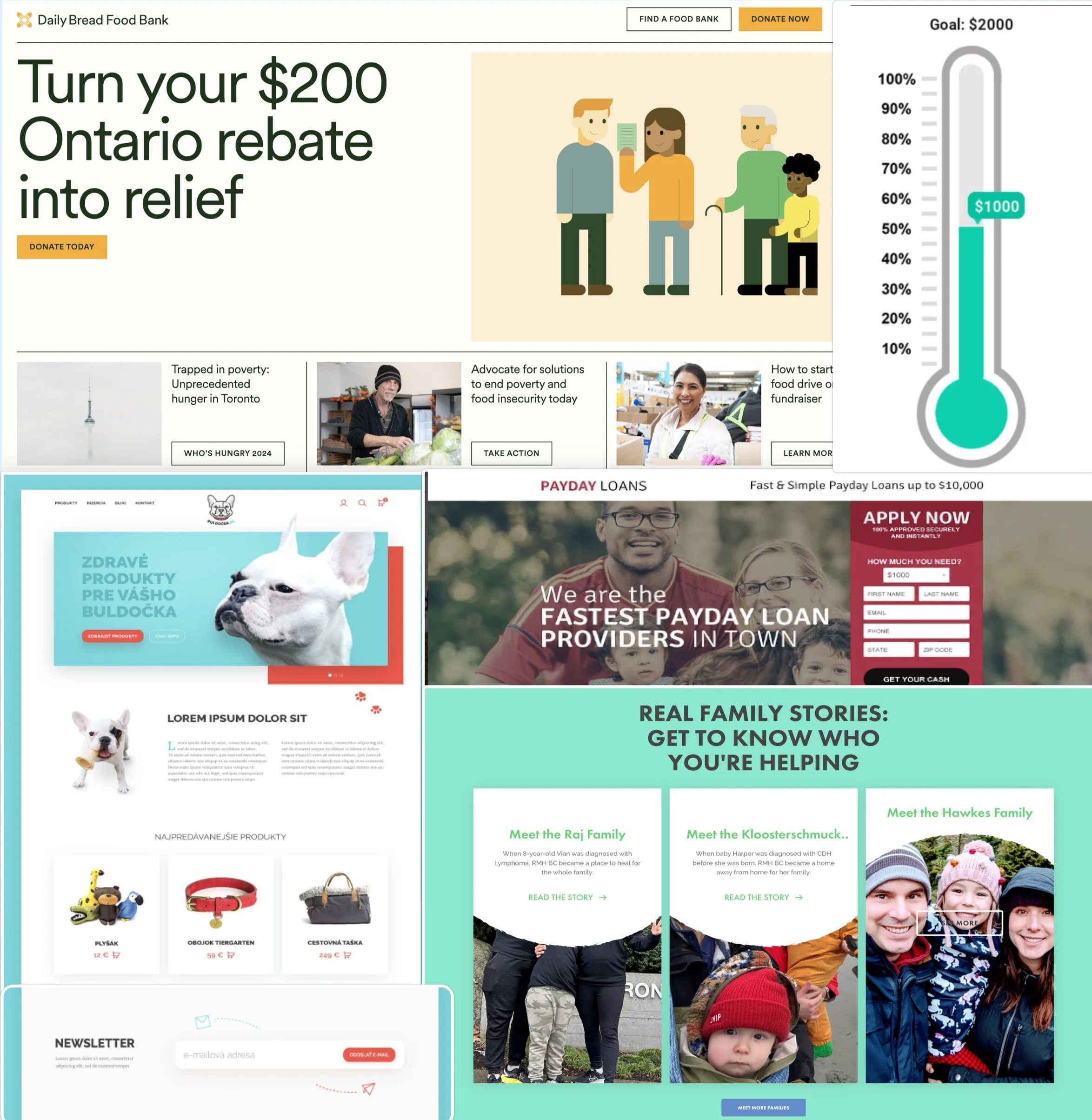
UI Inspiration
Our initial research phase helped us gather UI inspiration from the non-profit sector. This helped us understand the hierarchy of information and layouts that would benefit the Lower Mainland Christmas Bureau with both their volunteer and donation processes. Our group determined that we would include:
A main hero image and donation quick link accompanied by their mission statement in bolded text
Quick pathways using CTA buttons to encourage users to learn more about volunteering and gift recipient registration
Information sections for past, present, and testimonials from both volunteers and users of the program.
Increased use of imagery
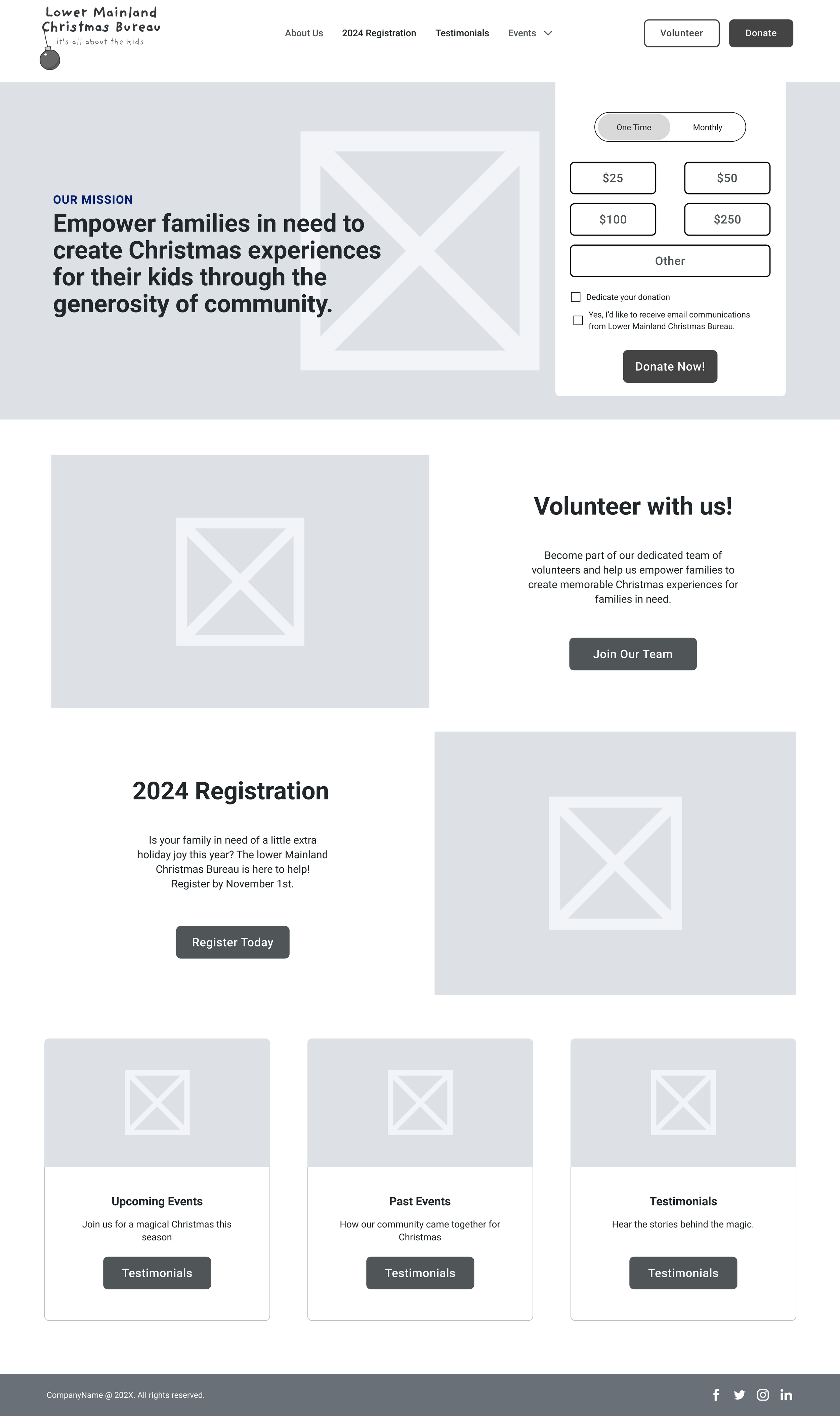
Conceptualization
We started creating the information architecture and low fi concepts for the landing, volunteer, and past/future event pages.
Once we created cohesive mockups that we felt provided a more fluid exchange of information, we conducted usability testing with 5 participants to see if our designs improved the initial volunteer sign up process. Our main goal was to ensure potential volunteers felt more confident in volunteering their time to the Lower Mainland Christmas Bureau. Once we had confidence in the design, we brought them to life by adding existing branding colours and imagery we found reflected the brand.
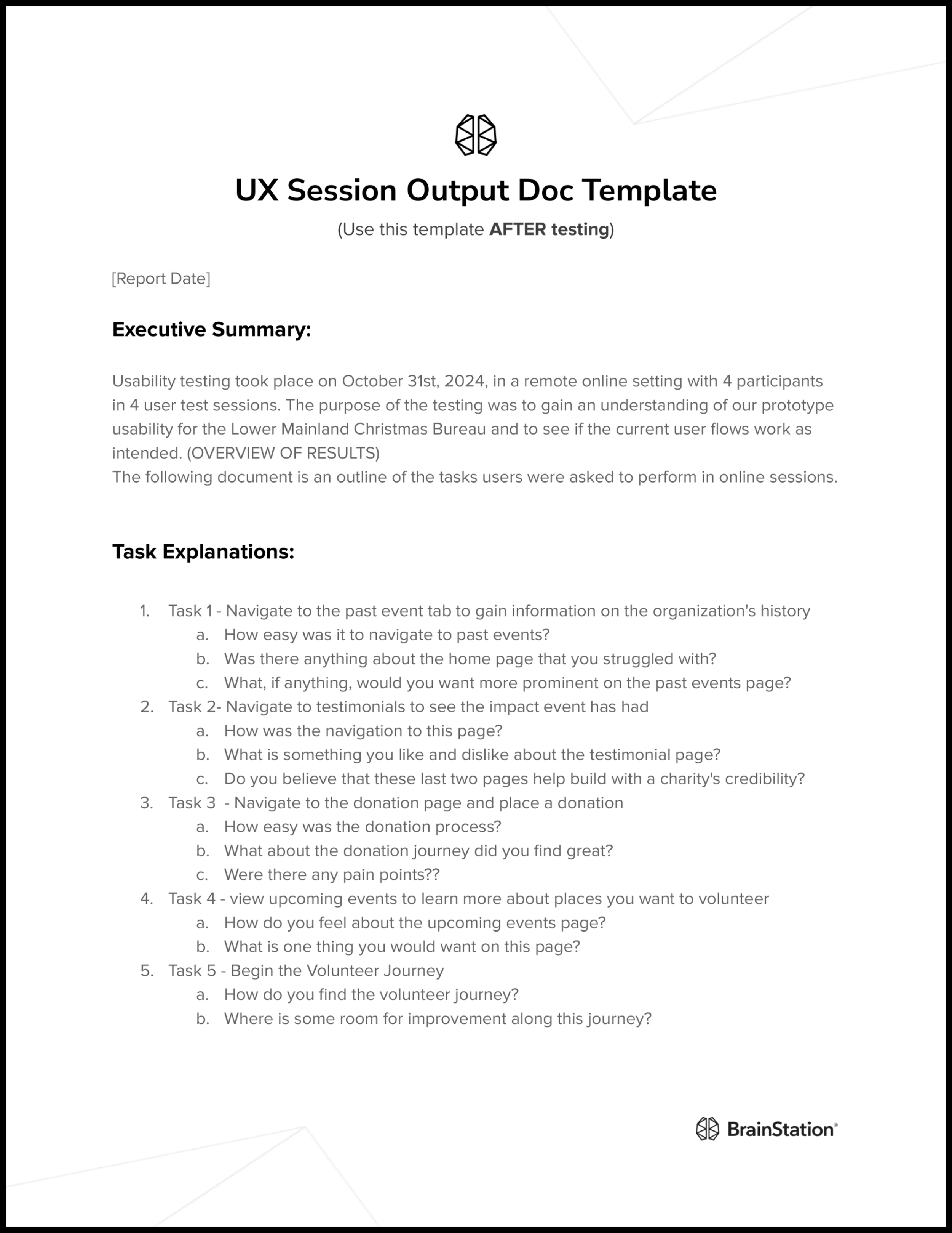
Usability Testing
Our team conducted two rounds of usability testing, including an internal and external session with five participants. Although all participants were able to navigate their assigned tasks, three key areas of improvement included:
1. Better image selection reflecting volunteer interests
2. Text selection, hierarchy and density required revision
3. Volunteer journey language should be more tailored
Reflections
Through this assignment, we gained a deeper understanding of the non-profit sector and what motivates engagement. We learned that a strong online presence, a compelling mission statement, and visual proof of successful initiatives are key to driving both donations and community involvement.
This sprint provided valuable learning experiences, particularly in two key areas. With additional time, we would have prioritized the creation of an "About Us" page to strengthen credibility through detailed information and contact details. We also learned the importance of precise specifications for prototyping and mockups. While our initial desktop design encountered minor discrepancies, the limited timeframe prevented us from implementing the necessary corrections.